
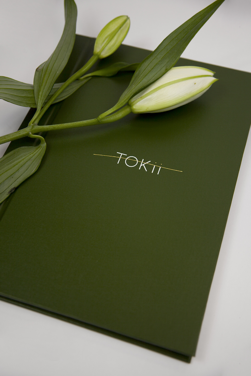
TOKii menus at The Prince Akatoki London.

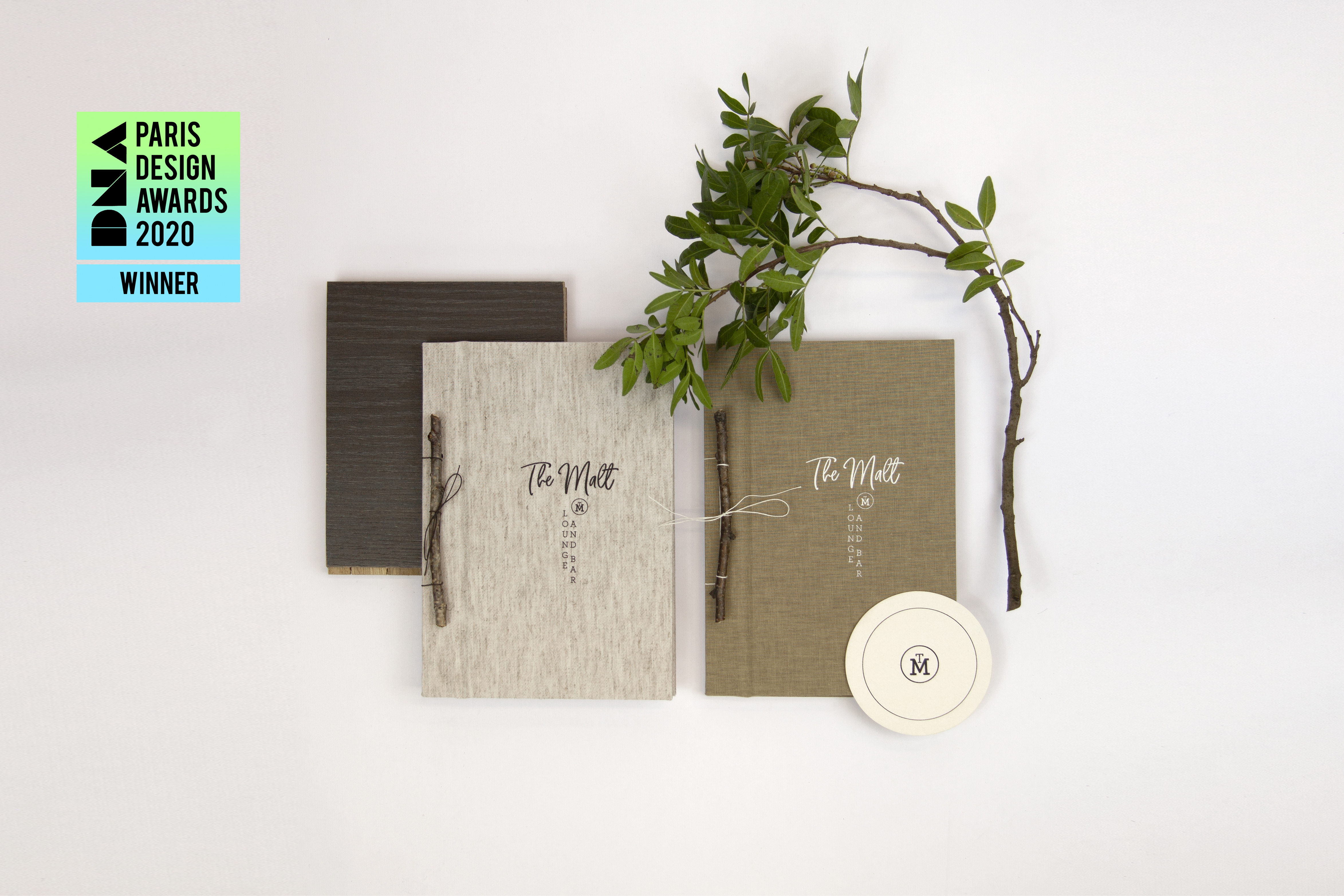
The Malt menus at The Prince Akatoki London.
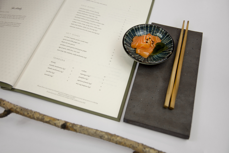
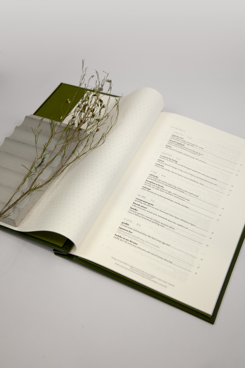
The wine menu at TOKii.
B3 Designers worked on the branding for the restaurants at The Prince Akatoki London hotel - TOKii, the Japanese restaurant, and Malt Lounge and Bar, the whisky bar that doubles up as a tearoom during the day.
TOKii
The TOKii logo is inspired by kintsugi, a Japanese philosophy that embraces the flawed and imperfect, and treats a breakage by fixing it with gold. It is in a sense, accepting it as an event in the life of the object, a part of its history, rather than something to disguise.
The TOKii logo is printed on a textured paper card, with the golden line of foil creating a subtle reference to Japanese culture.
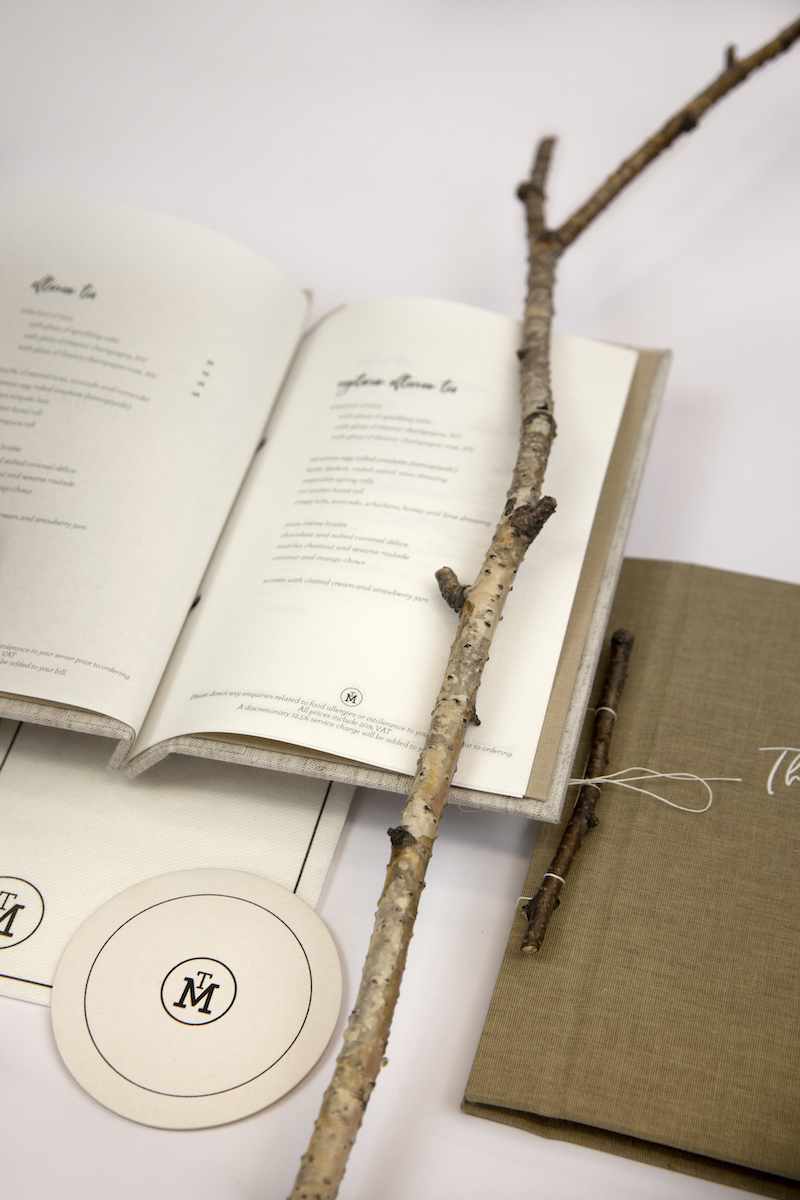
Whisky menu and collateral at The Malt.
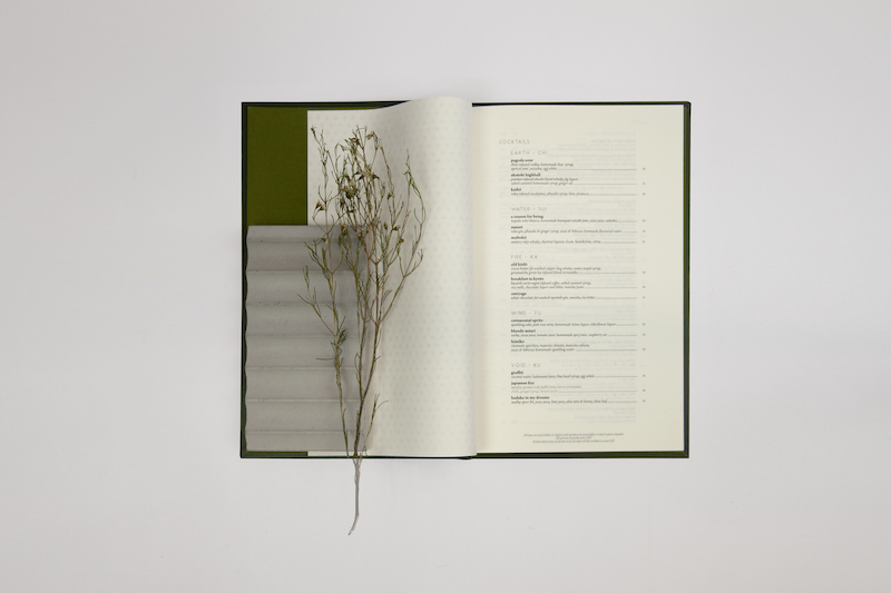
The wine menu at TOKii, printed on textured rice paper.
Malt Lounge and Bar
To produce the menus for Malt Lounge and Bar, we brought soft material and natural touches to the holders, using soft linen covering and a silver birch twig as a binding detail.
We used a Japanese rice paper stock throughout both the tea and whisky menus.
The menus were inspired by Japanese design philosophy.
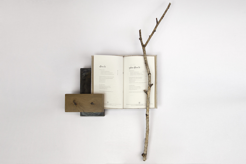
The menu is bound using a silver birch twig.
The Look & Feel focused on soft materials and natural touches.
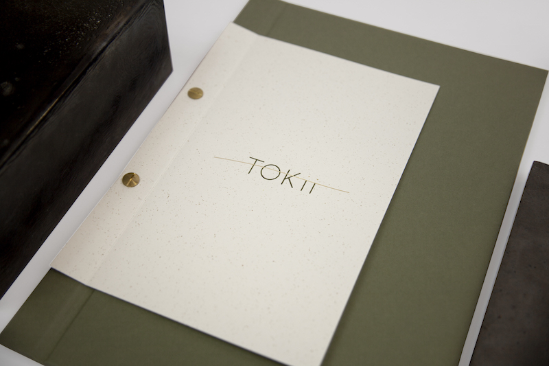
The TOKii logo is inspired by kintsugi, a Japanese philosophy that embraces the flawed and imperfect.
'When we rebranded from a British hotel to a Japanese hotel, the task we put to the team at B3 was monumental. The brief we gave them was to encapsulate the attention to detail as found in Japanese culture and bring that into the hotel. From day one our expectations were quite significantly exceeded. Each team member at B3, led by Mark, are not only fantastic designers but artists in the field of creating an ambience that fits the ideas we had on paper. Thank you, Mark and team!'
Ray Goertz - General Manager, The Prince Akatoki Hotel