
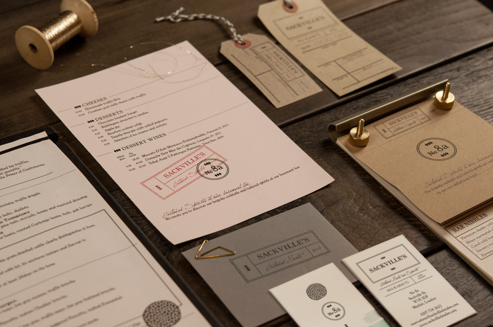
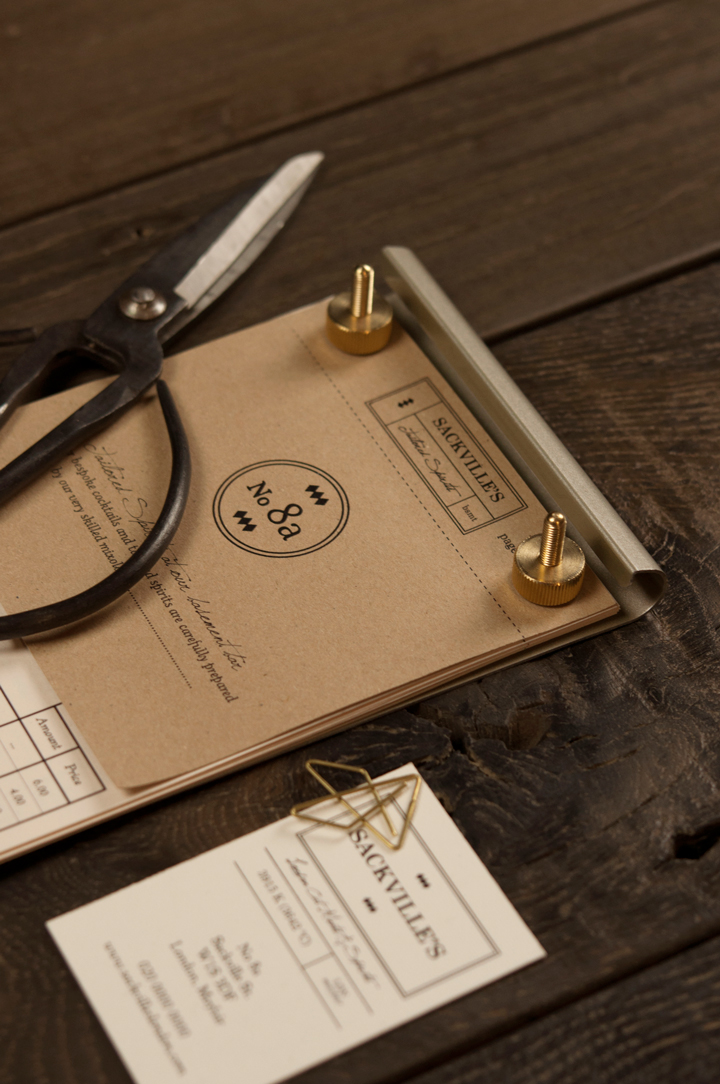
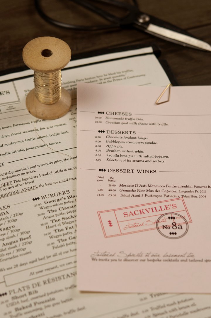
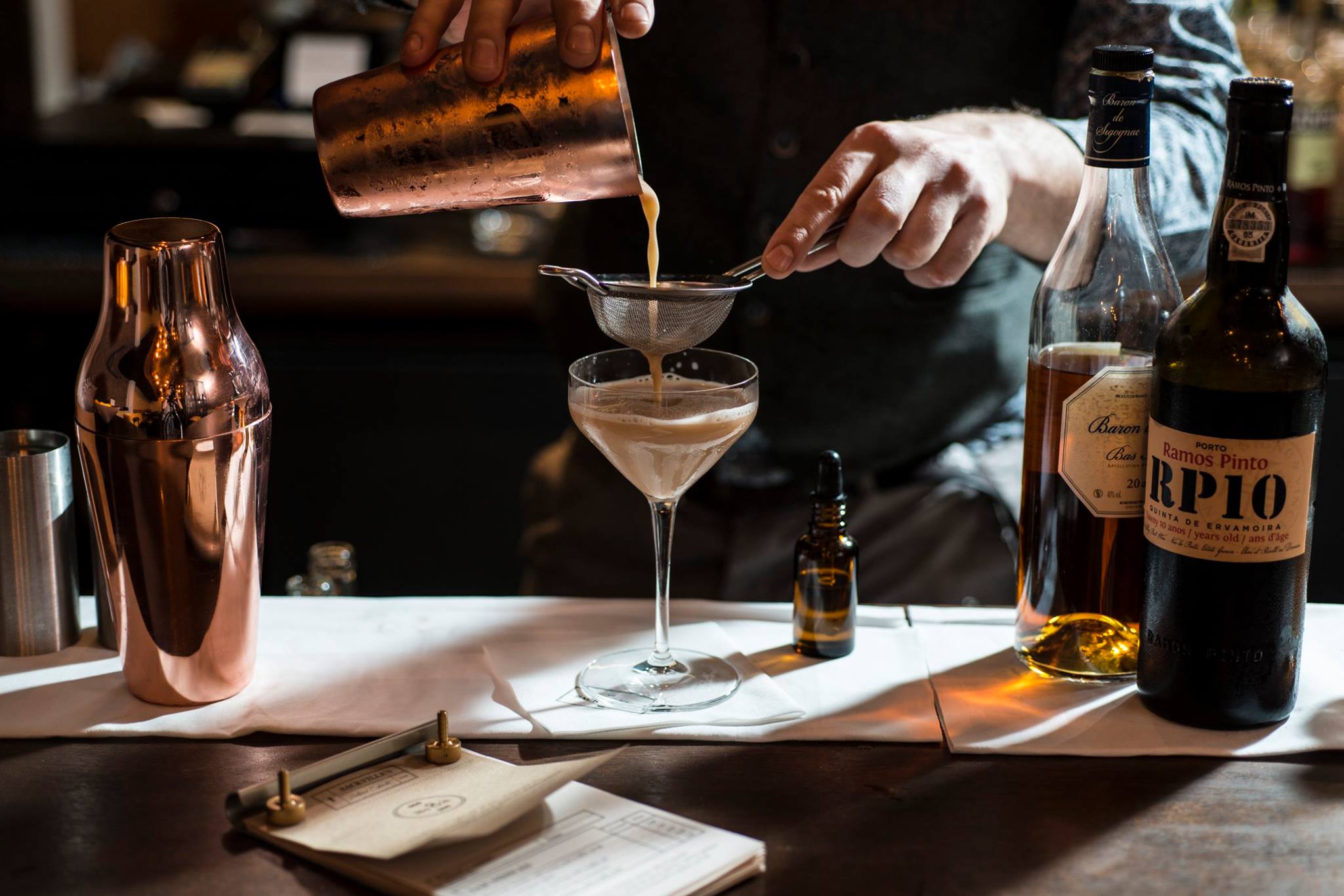
Sackville's menu and collateral.
We followed the history of the building as a tailor shop into the brand identity.

A collection of Sackville's menus and collateral.
Sackville’s brand identity is drawn from the sleek, sophisticated and understated luxury evoked through tailoring activity back in the 1960’s.
The menu’s key ingredient is the truffle - the rarity of this product and its black colour combined with tailoring aesthetics form the core of the brand identity.
The black tones of the truffle are depicted in the calligraphy on the slightly textured, off white paper menus, reminiscent of tailors’ paper.
As the building was historically a tailor’s shop and workspace, we used these two facets of the tailor identity to form a consistent design language throughout the space.
Dark grey woodwork and existing sandstone façade on the exterior create a moody and mysterious shop front.
Discrete signage and visitors only recognising the address by the door, ‘No. 8a’, evoke a speakeasy look and feel to the restaurant upon arrival.
‘No. 8a’, was chosen to evoke a speakeasy look and feel.
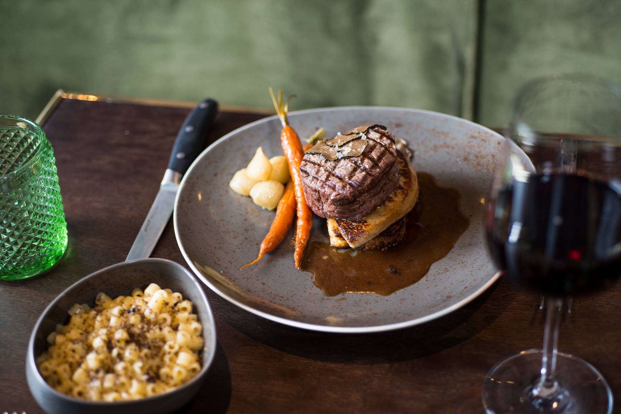
Truffle is the central ingredient of the menu.
Speakeasy Look and Feel.
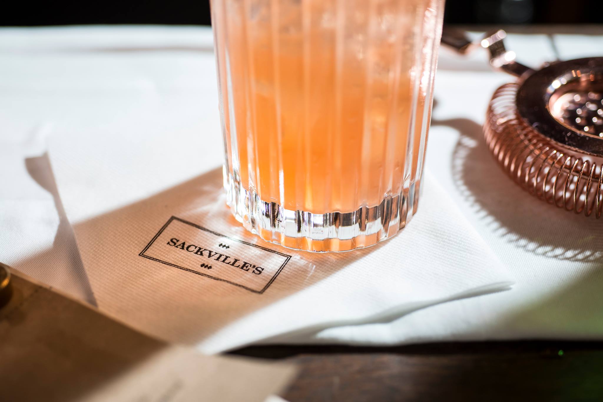
The logo is stamped on napkins.